Experiment on light depiction in anime-style illustrations using Image V2
ねOn this site, among people who create anime-style illustrations, the number of those using Image V2 (hereafter, V2) has decreased considerably compared to before (recently, it's just me and about 3 others!).
Also, there is prior research on this site regarding the characteristics of other major models (such as the albums of "やまびこ | yamabico"). However, there is no description of V2...
So, in order to rediscover even one strength of V2, share it, and serve as a reference so that everyone can create higher-quality anime-style illustrations with V2, I am writing this down! 🖊️
〈Experiment Details〉
- With the prompt and seed value kept the same, different expressions related to light were added to the prompt, and V2 was made to generate images.
- The common prompt is "anime style, cute girl, long black hair, white blouse, black skirt, forest, flowering plants, and blue sky," and this image is the default.
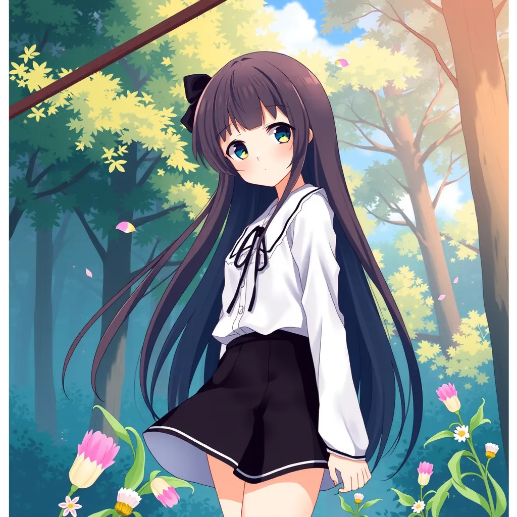
①Flash
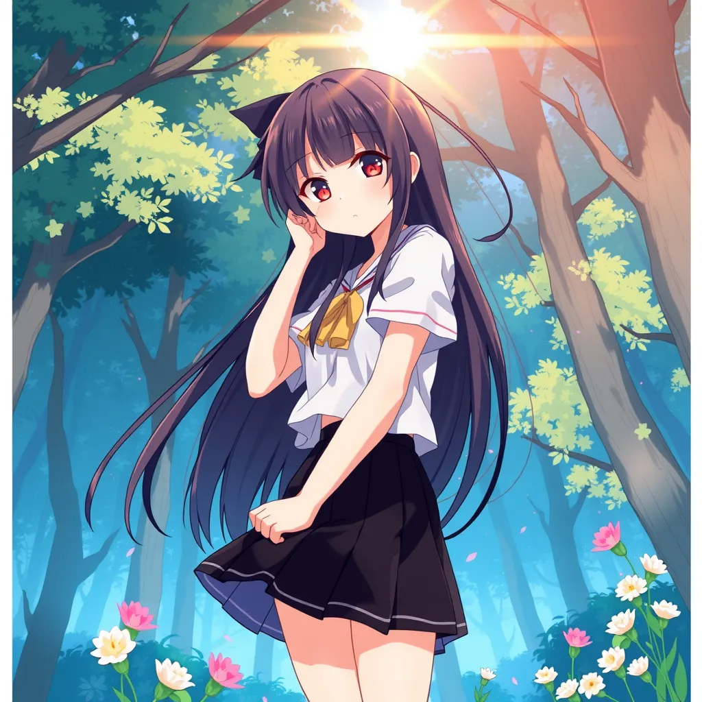
The sun not only became an accent of the image, but the girl's hair also gained a gloss, making it more three-dimensional ☀️
②Sparkling
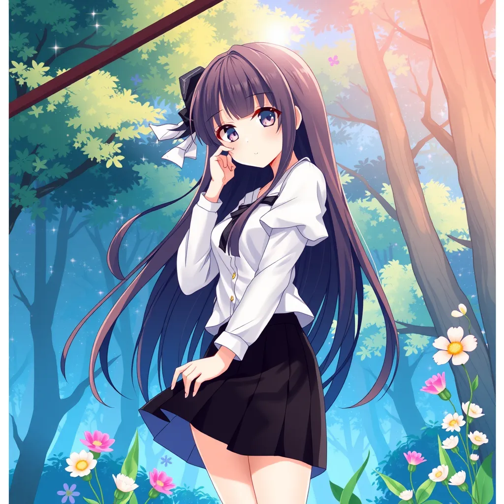
Particles of light were added among the trees, creating an image with gloss and gradation that is soft without being too dazzling ✨️
③Shining colorfully
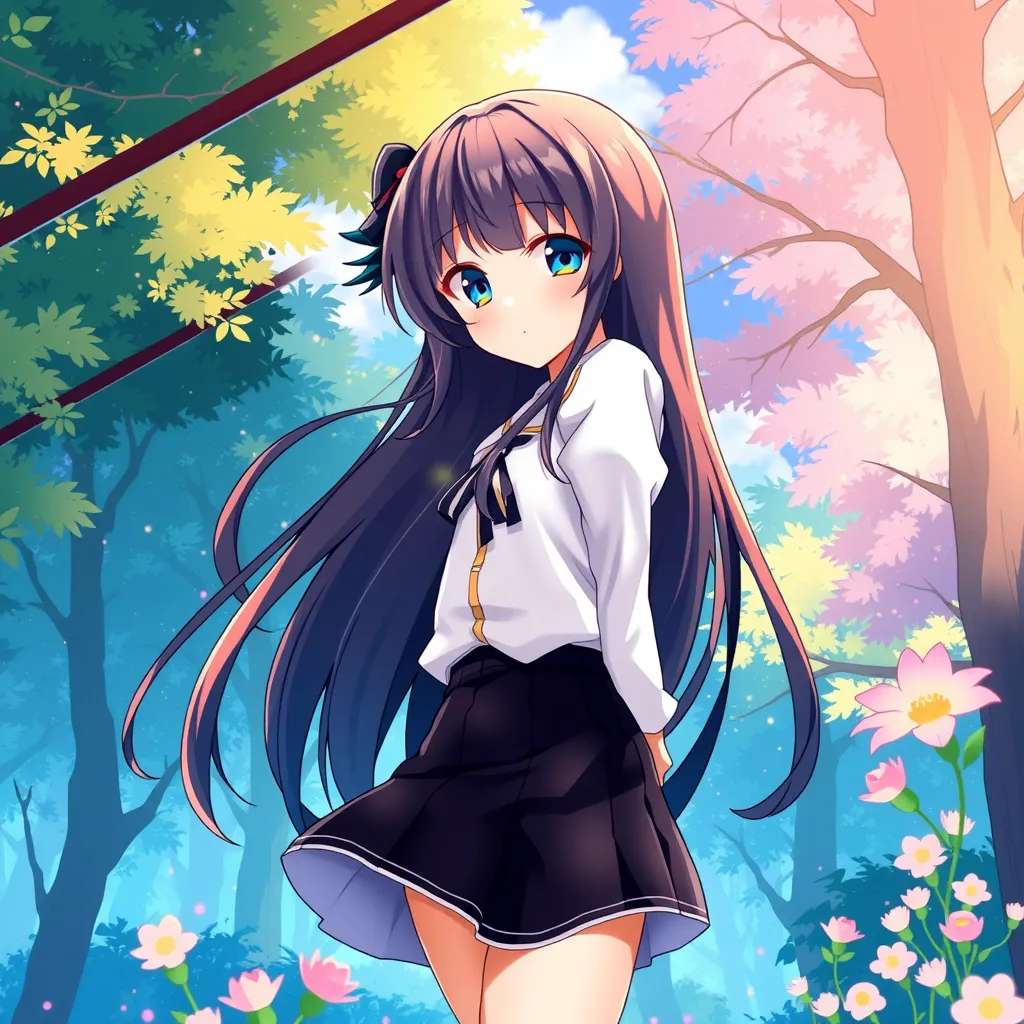
The constituent colors of the background, the girl's hair, and the skirt increased, making the image more vivid 🎨
④Moonlight
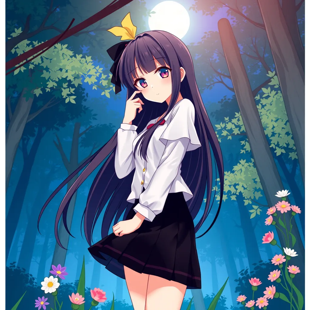
The girl's hair has a subtle gloss, the background takes on more blue tones, and a sense of depth can be felt 🎑
From the above results, it was verified that, when generating anime-style illustrations, by using prompts that describe light expressions, V2:
- Is capable of fine color differentiation
- Is skilled at rendering three-dimensionality and vivid colors through that
Going forward, it would be nice to dig deeper into color expressions that V2 has difficulty generating, and into V2's distinctive qualities regarding light depiction when compared with other models.
If you all get tired of other models, please do make sparkling anime-style illustrations with V2 ~ (With so few fellow users, it leaves something to be desired 😂)