Back to Discussions
Chat

A discussion about fonts.

すらいむん
Translated to English·

Some of you may have already noticed, but I think the font of the text on this site has changed. It's easier to read, but the characters feel a bit thin.

14 replies

まれん2·

Huh, is that so? Is it strange?

すらいむんOP·

Yes, it's unusual. It's very hard to understand, but it's a little unusual.

Both the home and community have been updated overall. I want you to regularly publish update information. 🕊️

It's becoming an M.

O
Otakosan·

I was wondering what the M stood for, and it turns out it's M for free.

The font was unfamiliar, so when I first saw it, I was worried whether this site was okay.

S
SNoW·

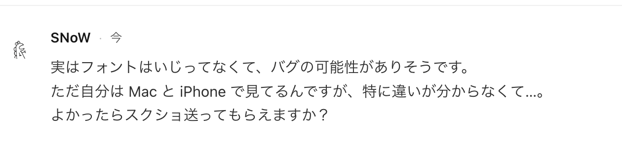
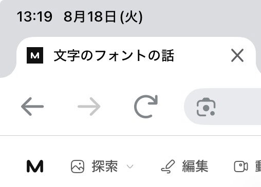
Actually, I haven't touched the font, so it might be a bug. But I'm viewing it on my Mac and iPhone, and I don't really see a difference... If you don't mind, could you send me a screenshot?

T
TEテツTSU·

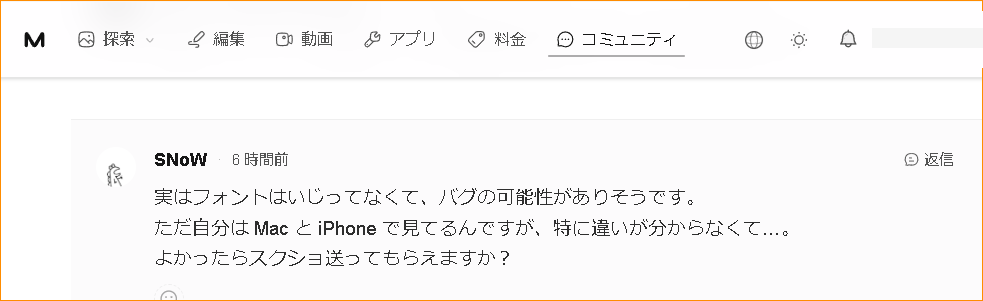
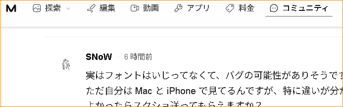
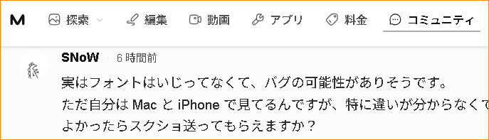
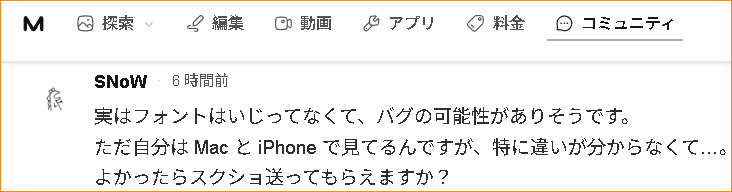
It might be difficult since browsers have their own quirks too.
Windows10 Brave
image
同 Vivaldi
image
同 FireFox
image
同 GoogleChrome
image

S
SNoW·

On my end, it's displayed like this.

image

Here it is
image

たぬー·

Personally, I don't dislike new discoveries; they feel like a treasure hunt. However, I also feel that the announcement section is a bit of a waste.

I’m the type who thinks similarly to Tanu-san, but as a site developer, I can imagine that by posting an ‘announcement,’ people might start saying things like ‘maybe this’ or ‘maybe that’ about the new features or other topics… so I kind of understand the reluctance to write one😔

Leave a reply

Join the community to share your thoughts and ideas.

Sign in to join the discussion